
My meteorology Blogs

A Brief Overview of Marine Heatwaves
What are they? Imagine the ocean running a fever for months on end. Sounds bad right? That is essent…
What are the impacts of the West African Monsoon?
Introduction The West African Monsoon is a label used to describe the seasonal variation in rainfall…

Atmospheric Turbulence
How is turbulence caused? Wind is the short answer. Without wind in the atmosphere, there would be n…
Coding Examples
Mathematical Programming
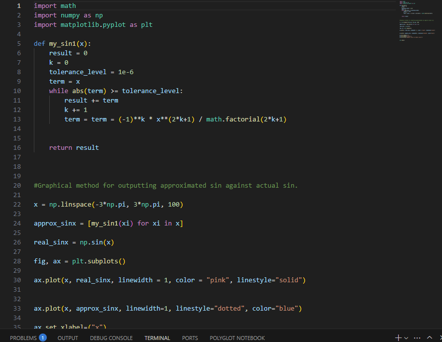
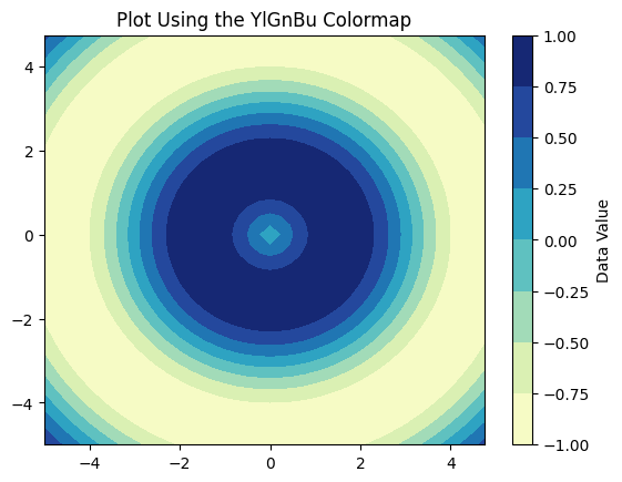
# -*- coding: utf-8 -*-
import matplotlib.pyplot as plt
import numpy as np
# 1. Create dummy data
X = np.arange(-5, 5, 0.25)
Y = np.arange(-5, 5, 0.25)
X, Y = np.meshgrid(X, Y)
Z = np.sin(np.sqrt(X**2 + Y**2))
# 2. Plot the data using the 'viridis' colormap
plt.figure()
# Specify 'viridis' using the cmap argument
plt.contourf(X, Y, Z, cmap='YlGnBu')
plt.colorbar(label='Data Value')
plt.title('Plot Using the YlGnBu Colormap')
plt.show()
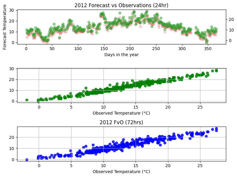
The figure on the left compares the forecasted temperatures versus observed temperatures (FvO) through a correlation map.
It also exemplifies how data can be manipulated slightly if you take the correlation of FvO over a 72 hour period, which increases the gap between each reading in the data, and allows you to compare forecasted versus observed for nighttime observations aswell as daytime observations.
As the graph reveals, the FvO is not significantly affected at Reading University Atmospheric Observatory by such differences, as the correlation is still positive and largely follows the same trajectory as temperature increases, as supported by the graph having a reduced y-axis scale.
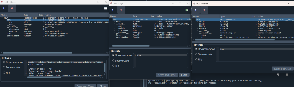
Statistics of and 3pm forecast temperature at the Reading University Atmospheric Observatory – presented as objects in a class. FC24 and FC72. VC24 is the accuracy of the forecast using A|B|C|D (forecast hit, forecast miss, false alarms and correct negatives).
A-Level Project (2024)
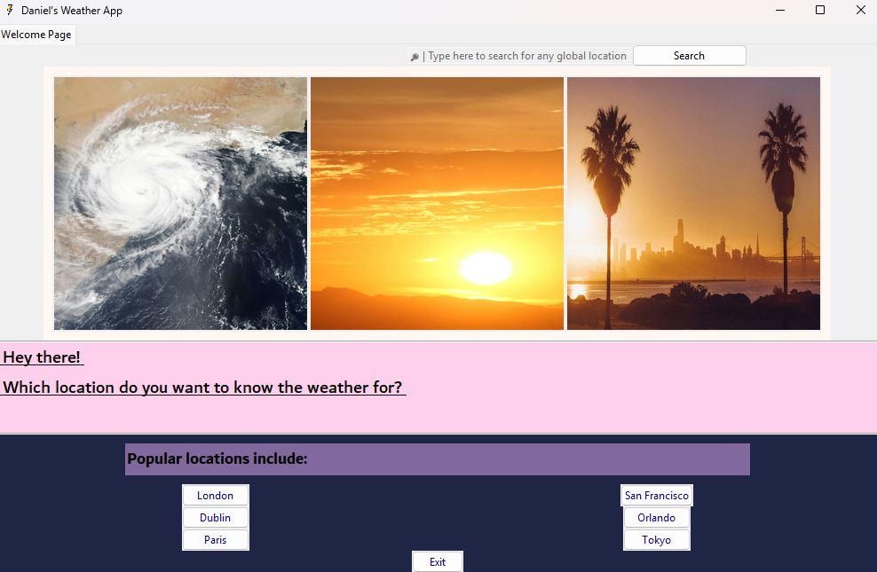
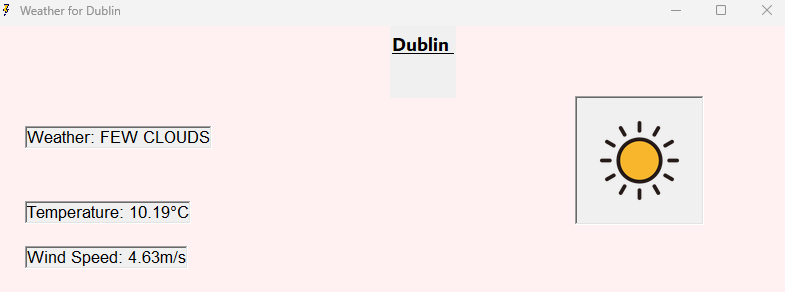
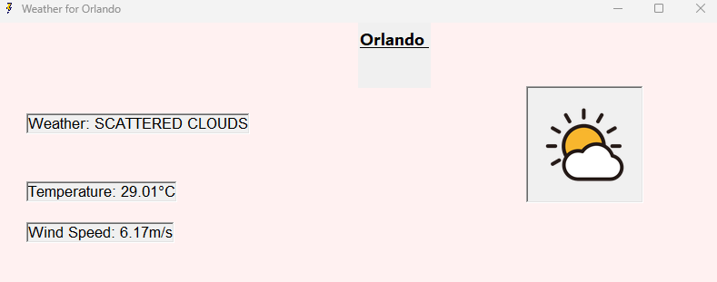
Below are screenshot’s of the basic Weather App using Python during my Computer Science A-Level final year project. Please find the documentation, and files should you want to download on a desktop computer below.
In the future, I will develop this project further such that it
- A) becomes more fully featured than providing observations
- B) would work on Android Devices too!
Link: Daniel’s Weather App – Google Drive

Email: daniel.robert.hutton@outlook.com